Are you spending hours on reports but feel no one is reading them?
And even if people do read your reports, do you get frustrated because they don’t get what you’re presenting?
Wouldn’t it be cool if you had a quick and easy way to create reports that your audience can immediately understand?
This article is a beginner’s guide on how to create easy-to-read reports by visualizing key metrics that tell a persuasive story.
What is visual data?
We are creating, collecting and saving tons of data every single day.
Studies show that 80 percent of the data today has been created in the past two years, and the amount will grow exponentially with all the Internet-of-Things products coming to the market.
Everything is connected to the internet, which makes it easy to track what’s going on and what’s happening (or has happened).
All this data is stored in databases, but all that raw information is not really telling you a story, right?
We generate so much data, but we don’t know what to do with it when we have it! And we certainly don’t know how to use that data persuasively.

Generating an understandable image from data that tells you a story is called VISUALIZING DATA.
Why is visualizing data important?
Raw data can be difficult to interpret. Visualizing your data will help you understand and see in a few seconds what your data means.
For instance, you can quickly tell if sales have peaked or revenue has decreased in the past three months.
Presenting data using the right type of chart will convey your story visually to your audience.
Here are some basic charts and how to use them. This way, you’ll use the right chart for the right reason.
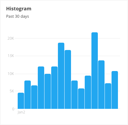
Histogram
We use this type of chart to split data into groups and segments. It can show you the biggest and smallest segments.
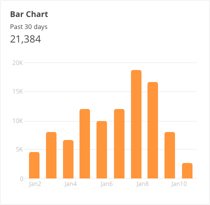
Bar chart
The bar chart is one of the most popular charts used in visualizing data. Use this chart to show growth month after month or changes in sales.
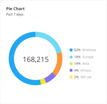
Pie chart
Who doesn’t like pie? Seriously, the pie chart is often used incorrectly. Use this ONLY when you want to explain an important share or part of the whole. For example, if you want to show the percentage of people who access your website using a mobile versus a desktop device, the pie chart will do this in the best way possible.
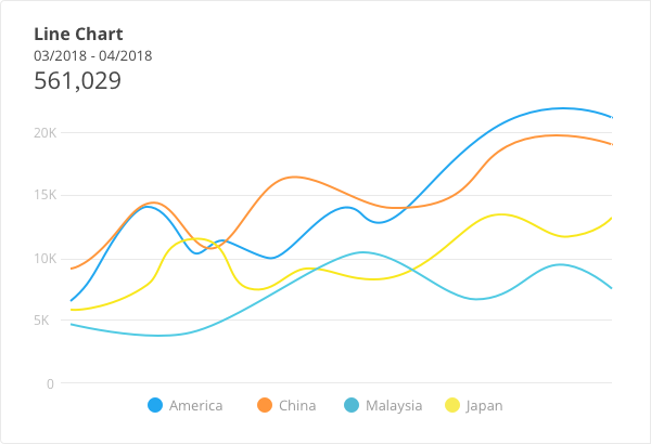
Line chart
The line chart can be used in many of the same situations as bar charts. But the cool extra dimension the line chart gives you is the trend line. In a lot of dashboards, the bar and line chart are combined to show your sales and the trend in sales. (Your boss will be impressed!)
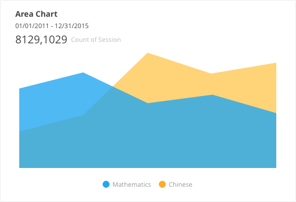
Area chart (stack chart)
The area chart, or stack chart, can be hard to read; use this with caution. But sometimes it can be of real value.
For example, if you want to see where your website traffic comes from, the area chart can work nicely. You can immediately see the percentages from Google Search, advertisements and social media. It will “stack” all three results so you can see which channel has added the most referral traffic to your website.
Is your data telling a story?
Most people use Microsoft Excel or Google Sheets to create a spreadsheet of their data, which is a very accessible way to organize and store multiple types of data.
Most companies use spreadsheets to create several reports every week or month to review.
You’re probably creating these reports yourself—but does your audience understand them?
It often seems the creator of the report knows everything about the data, but for the average reader, the report is too complex to understand.
Here’s the problem.
The content is relevant and important, but it’s not telling the STORY the creator wants to tell.
If you perpetually send reports that are too difficult to understand, you’ll struggle in trying to convince someone to act on the report’s findings.
On the other hand, if your audience knows it’ll be able to understand your report within 10 seconds, they’ll open it immediately and act on it. Makes sense, right?
When do I use data visualization?
If you’re familiar with the basic charts in this article, you likely already have some ideas on how and when to visually present data.
The main goal of using data visualization is to explain the real story behind the data. But it will also help in these two cases:
Example #1: Team updates/get in sync (get back your team efficiency)
First, stop sharing those weekly or monthly spreadsheets nobody looks at!
Does the following scenario sound familiar? At team meetings, everyone is on their laptop, opening their own reports, spreadsheets or apps to make their plan, schedule, notes, etc. This is not an efficient way to coordinate and sync team activities.
As a team leader or manager of a team, you can make everyone’s lives much easier by synchronizing the team’s many activities in one place. Slack, Trello and Confluence are some good project management and collaboration tools that help you achieve this goal.
Get your team to look at a gorgeous dashboard, like Datadeck, that updates itself and shows the latest insights. It will save you and your team time when making reports and analyzing the data so you can start thinking about actions that will improve your numbers. This will allow everyone to spend more time doing the job they should be doing.
Example #2: Impress your boss
It’s never a main goal to impress your boss.
But let’s be honest here.
Let’s say your boss is Jane. And let’s say you are aiming to get a bigger monthly marketing budget. If you show Jane a bunch of numbers that she can’t understand right away, she will probably start asking you a lot of hard questions.
On the other hand, imagine you’ve prepared an instantly understandable report that shows the ROI in a simple, attractive format. You’ll likely not only convince and impress your boss, but you’ll get that extra budget too!
Use Datadeck to help visualize your data!
Wouldn’t it be great to have an alternative to Excel that helps you create stunning reports so you can impress—and convince—your boss, team members or clients? Well, there is!
Datadeck is an easy-to-learn application that will help you visualize data from all types of data sources.
You can invite your team, boss and clients to work together on reports, and share them with whomever you like.
Imagine having these kinds of features at your fingertips:
- Manage all your reports in one place
- Get access to all your spreadsheets
- Integrate Datadeck with Slack, Trello, Confluence and many others
- Pull data from, for example, Facebook or other social media platforms
- Share these reports directly with your team, clients or boss
Are you ready to make your data understandable and actionable . . . and save TONS of time?