It can be downright frustrating, can’t it?
You spend 12 hours crunching your marketing metrics to share with your marketing team.
Only to find out . . . nobody bothers to read it.
You even used different spreadsheet templates that promised to save you hours of work—but they all failed.
Ouch.
So, here’s the question.
How can you bulletproof your marketing metrics, results and KPIs so everyone on your team reads—and understands—your message within 10 seconds?
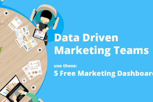
This article will show you how to create a simple, customized dashboard for all the members of your marketing team by merging all the data from your various marketing applications . . . even if you use a few (or dozens) of different apps.
Your marketing team collects tons of data, metrics, KPIs and results.
But do you ever use most of that data?
Probably not.
Let’s look at a marketing team in a mid-sized company.
- Marketing analyst
Analyzes most of the marketing data and supports choices in pricing and marketing budgets - Content marketer
Focuses on high-quality content in the form of copy, video and images - Social media coordinator
Manages all the social media feedback, content and channels - Marketing manager
Leads the team, inspires and sets the tone and direction
In the roles above, most likely everyone is using their own software to do their job.
For instance, here are some commonly used software tools that many digital marketers use:
Google Analytics
Google Analytics collects tons of information on website behavior, but in some cases, it can be hard to analyze.
Google AdWords
Companies can use Google AdWords to run marketing ads or campaigns to generate more traffic and sales from Google.
Majestic, SEMrush, Google Search Console
These tools can help optimize your traffic and reveal which keywords can help you create better content and increase your organic search results.
HubSpot, Salesforce
Both tools are effective CRM (customer relationship manager) systems. They store all your communications with your clients and prospects, follow up on sales funnels and even create automated email campaigns to track every event.
Intercom, Zendesk
Intercom and Zendesk are great ways to let anyone have a quick chat or record a phone call and store them in your CRM system.
MailChimp, ActiveCampaign
Run email campaigns to activate, nurture and engage your audience. Automate email campaigns, create automated sales funnels and encourage customers to return.
HootSuite, IFTTT, Buffer, Zoho Social
These are all applications to make your social media life easier. Social media managing apps help control and focus where to create content instead of your having to guess on your own.
What’s the problem with using all these tools?
Well, nothing’s wrong with using them; they’re great at what they do … by themselves.
Here’s the problem.
They’re not good at creating reports that your team can instantly get in sync with.
Can you imagine how cool it’d be if you could create a marketing report that merged HubSpot, Intercom, Google Analytics, Facebook, Twitter, YouTube, multiple spreadsheets and internal MySQL databases into a single, easy-to-read dashboard?
And what if this dashboard represented all the key metrics from your team members’ apps in one dashboard . . . instead of looking at 12 different boring reports?
AND what if you could create that report in about 15 minutes?
Let’s look at how you can do just that.
Here are some examples that show you what it looks like when you combine all your separate marketing apps into one dashboard.
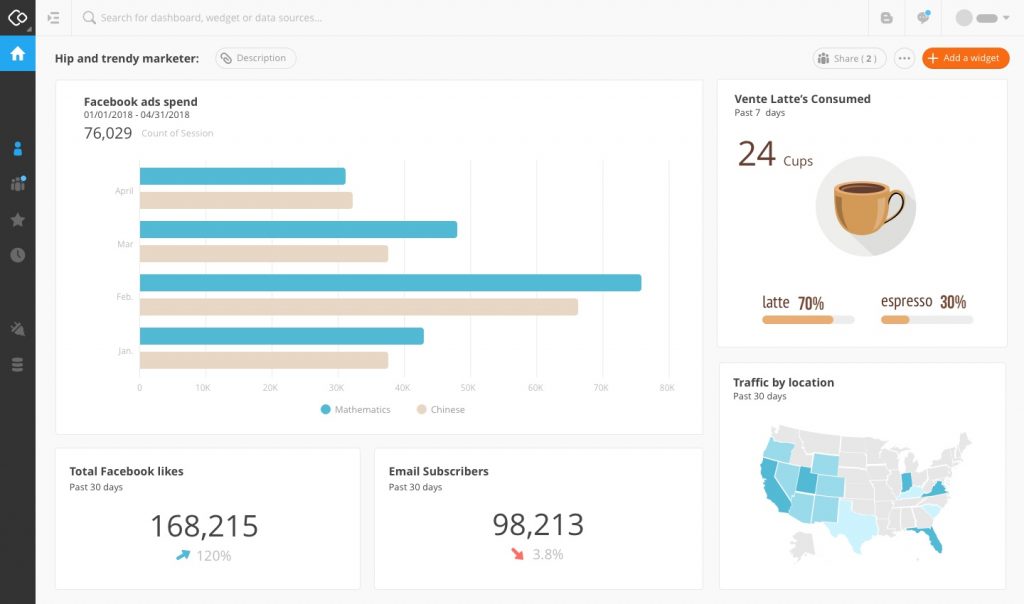
The Hip and Trendy Marketer
The perfect dashboard for the marketer looking at his Facebook campaigns, new email subscribers, US traffic by location and how many lattes vs. espresso he drank this month.
The “Data Nerd”
For real data lovers, here’s a sample mix of MySQL, different spreadsheets and Google Analytics data. All in one automated dashboard. How cool is that!
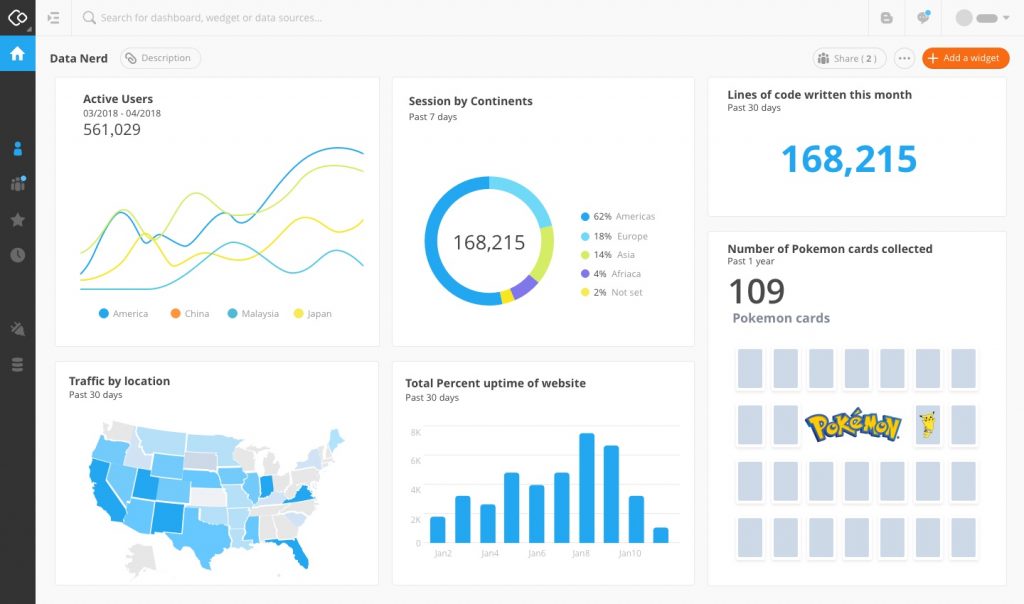
See how beautiful and easy to read these graphics are?
And they’re all from eight or more data sources!
Now imagine this . . .
You’ve created a report and shared it with your social media manager.
He loves the report but wants to add two more specific YouTube results.
Boom! No problem. You can adjust his report in minutes.
Here’s the secret behind creating these reports: everyone is looking at the same source of data, but each person can make a localized version of a report based on their specific needs—without affecting the rest of the raw data.
10-second overview reports (for your CEO)
Now imagine your CEO wants a customized report featuring certain data points not discussed in your meetings.
No problem.
Again, you can create a dashboard in minutes that reflects exactly what she wants.
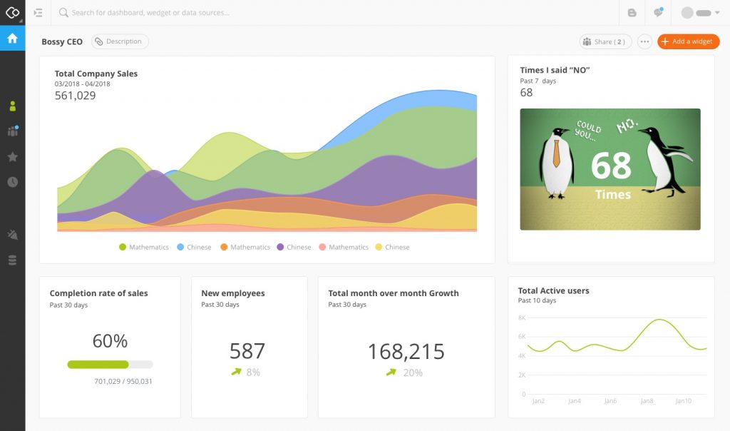
CEOs love getting 10-second dashboard overviews that they can access whenever and wherever they want.
Are you ready to change the way you run your typical marketing meetings?
Use our free start-up trial version for 30 days!