I have been making some videos to show how easy it is to visualize data.
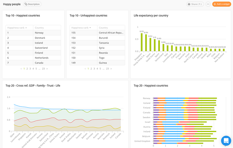
In my 4th episode of “Let’s make data fun” I teach how to use a dataset from Kaggle.com and turn it into a beautiful dashboard, that will show you which countries are the happiest in the world.
Subscribe to my Youtube channel, leave a comment and claim your FREE Data Dum Dum T-shirt.

- Live view of the dashboard in Datadeck
- Happy world countries data set on Kaggle.com


